
American Motorsports Magazine
SKRT is an American automotive sports magazine that explores the culture, inner workings, and talent that have built a vibrant community. With a focus on women and youth, SKRT boldly fills the representation gap left by traditional car magazines that cater to older men. As motorsports experiences a new surge of interest in the United States, SKRT stands tall as a voice of the new-age motorsports community.

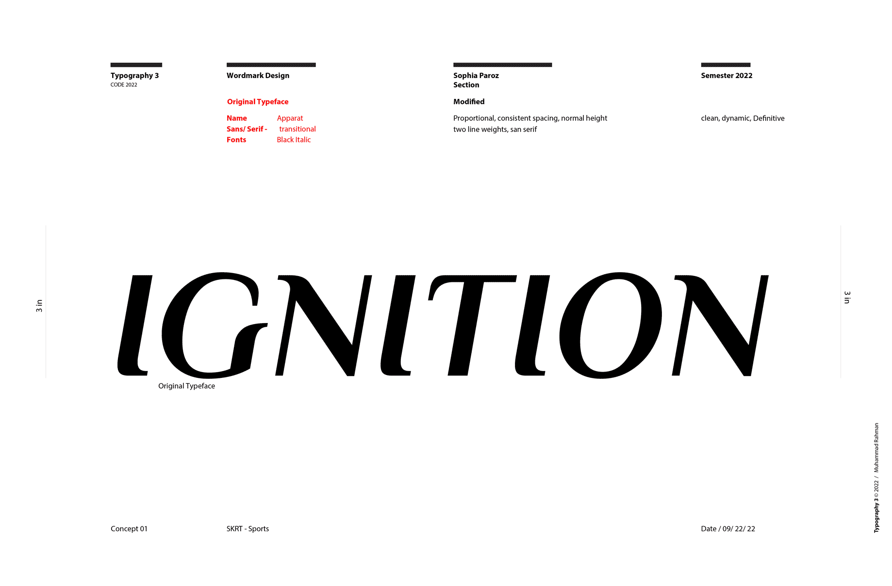
Wordmark Creation
The wordmark needed to capturing momentum and I wanted the SKRT to be assertive. I chose a Gothic Sans Serif to embrace the boldness that is SKRT. Then I played with flow of letter structures and repeating lines to achieve the momentum dark, blocky, type often lacks.
Exploring Texture
To capture the grit and energy of these sports I experimented with black paint, toy cars, tape, and my home scanner.


Exploring Texture
SKRT is about pushing limits, exploration, and education. I wanted to tackle creating a style guide that encouraged these ideals, while still creating a cohesive identity.
In every edition of the magazine there will be one spotlight interview article: interviews are design in black and white or grayscale. All other articles are full color.

Spread Exploration
In every edition of the magazine there will be one spotlight interview article: interviews are design in black and white or greyscale. All other articles are full color.
In doing so I human experiences in motorsports are emphasized and deeper conversation about racing can be created.

Final Spreads


Takeaways
In the process of crafting this magazine, I discovered the importance of pushing the boundaries of design beyond one's comfort zone. It became evident that without daring to take risks and embrace experimentation, design efforts inevitably stagnate. While the outcomes of experimentation may occasionally diverge from initial expectations, each exploration enriches one's design toolkit, fostering growth and innovation.